How to Make a Graph in Excel

March 17, 2026

We work in a data and analytics-driven world, and every small business owner needs to have at least a basic understanding of data analytics. More importantly, you should be able to turn raw numbers into visual representations. Graphs transform complex spreadsheets into clear, impactful visual narratives, making it easier to illustrate trends and draw insights that will impact your decision-making.
Microsoft Excel is a leading tool for data analysis, but it can feel overwhelming and daunting when you’re looking at a whole bunch of numbers in cells. Knowing how to make graphs in Excel can help you turn your business’s most important numbers into visual aids to make business decisions, influence investors, and inform your future. Excel offers a wide array of chart types to help you visualize information effectively. Here, we walk you through the entire process, from preparing your data to exporting a professional-looking graph.
Step 1: Prepare Your Data
The foundation of any great graph is well-organized data. Taking the time to prepare your data correctly will save you significant frustration in the future.
Organize Your Data Properly
Excel can be finicky, so it’s important to properly organize your data before you try to make a graph. Here are some tips:
- Use clear headers: Ensure the first row (for columns) and/or first column (for rows) contains clear, descriptive labels. Excel uses these as your chart’s axis labels and legend entries.
- Ensure data consistency: Make sure all of your units and dates are the same. For instance, if you’re using $, make sure every cell is formatted as $ and expanded to two decimals. Use a uniform date format, such as MM/DD/YYY. You should also avoid merged cells within the data range you plan to use, as this can confuse Excel’s charting function.
- Place related data in adjacent columns/rows: You can select non-contiguous data, but putting related data next to each other makes it easier for Excel to interpret the data better.
Once you’ve organized your data, it’s time to clean.
Clean Your Data
Cleaning your data doesn’t require a mop, it just requires some focus. Before you graph, scan your data for common issues like blank rows or columns in your intended data range, error values like #N/A, #DIV/0!, or #REF!, or any cells that are formatted in a different way. Cleaning your data is essential because even small errors or inconsistencies can completely throw off your graph.
Select Your Data
After cleaning and organizing your data, selecting the range is pretty straightforward. Just click and drag your mouse to highlight all the cells you want to include in the graph, including the column and row headers. If you’re highlighting data that isn’t next to each other in the sheet, select the first range, release the mouse, and then hold Ctrl (Windows) or Command (Mac) while selecting the second range.
Step 2: Choose the Right Graph Type
With your data selected, it’s time to insert the chart. Here’s how to do it:
- Navigate to the “Insert” tab on the Excel ribbon.
- Look for the “Charts” group.
- If you’re unsure which chart to use, click the “Recommended Charts” button. Excel will analyze your selected data and suggest appropriate visualization types, often providing the best starting point.
- If you know exactly what you want, select a specific icon from the “Charts” group (e.g., the bar chart icon, the line chart icon).
Excel can make it pretty easy to format your data in a way that makes the most sense, but it can also make things unnecessarily complicated sometimes. That’s why it’s important to understand some key graph types and when to use each.
Graph Types and Their Purpose
Selecting the correct graph type is crucial for conveying your message accurately.
| Chart Type | Purpose | Example Use Case |
|---|---|---|
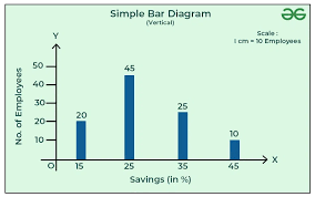
| Column/Bar Charts | Comparing values across different categories. Column charts use vertical bars, while Bar charts use horizontal bars. | Comparing total sales revenue of five different products over a single month. |
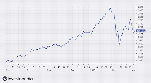
| Line Charts | Showing trends or changes over time (sequential data). | Tracking the stock price of a company over the last quarter. |
| Pie Charts | Illustrating proportions and percentages of a whole. Use sparingly—best for 3-5 categories. | Showing the market share distribution among competitors. |
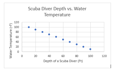
| Scatter Charts | Displaying the relationship between two sets of numerical data points. | Plotting hours studied versus test scores to show correlation. |

Step 3: Customize Your Graph
Excel can handle much of the heavy lifting to create a basic chart, but you’ll still want to customize it to fit your needs. When you select the chart, the Chart Design and Format tabs appear on the ribbon in Excel. You can use these settings to refine the chart’s look for maximum clarity and professionalism.
In addition to these buttons, you can also use the three icons next to the chart area to add customization: the Chart Elements icon (+), the Chart Styles icon (paintbrush), and the Chart Filters icon (funnel).
Some key items you might adjust:
- Axes: Click the + icon (Chart Elements) and check Axis Titles to add descriptive labels for your X and Y axes (like “Revenue” and “Month”).
- Data series: To change the color, border, or shape of your bars/lines/points, right-click a data series and select Format Data Series. That way, you can customize it to fit your branding or highlight certain trends.
- Text: Double-click the Chart Title or any data labels to edit the text directly. A strong title summarizes the graph’s main takeaway.
- Chart area: Select the background area of the chart to modify its fill color or border.
- Chart type: If you realize a different visualization would be better, go to the Chart Design tab and click Change Chart Type. Excel can automatically format your data when you change the chart.
Customizing your chart will help you ensure you’re presenting data the way you intend and allow it to have the maximum impact.
Step 4: Export Your Graph
Once your graph is complete, you’ll likely need to share it outside of Excel. The simplest way to do that is to copy and paste it into other applications. You can easily copy and chart by clicking it and pressing Ctrl+C (Windows) or Command+C (Mac). Then, paste it into another Office app using Ctrl+V (Windows) or Command+V (Mac), or into a non-Microsoft app. In Office, the chart remains linked and editable, but you may not be able to make changes if you paste it into a non-Microsoft app.
You can also export your graph by saving it as an image file (PNG or JPEG). To do that, right-click the border of the chart, select “Save as Picture,” and choose your desired file format and location.
Troubleshooting Common Problems
If you’re struggling to create the chart you want, here’s how to troubleshoot a few common problems:
| Problem | Cause | Solution |
|---|---|---|
| Data Series are on the wrong axis. | Excel incorrectly interpreted your headers/data range. | In the Chart Design tab, click Switch Row/Column. |
| Graph has no X-Axis labels. | Excel is plotting the labels as a data series. | In the Chart Design tab, click Select Data, and manually edit the Horizontal (Category) Axis Labels. |
| The chart is blank. | Your data selection included an empty cell or range, or an error value. | Check Step 1. Ensure your data is clean and the selected range is correct. |
FAQs
Yes, this is a Combo Chart. After inserting a chart, go to the Chart Design tab, click Change Chart Type, and select “Combo” at the bottom. Combining charts is especially useful for plotting data series with different scales, allowing you to use a Secondary Axis.
Excel charts are dynamically linked to their source data. As soon as you update the numbers in your spreadsheet cells, the chart will automatically refresh.
Take a look at our news on Business Essentials