What Are Lead Capture Pages and How Do You Create Them?

November 13, 2025

Any successful digital marketing strategy boils down to one key element: the ability to turn anonymous website traffic into known, contactable leads. That transition happens on a lead capture page.
Unlike a general website page, a lead capture page is highly focused on the explicit purpose of conversion. Understanding how a lead capture works is essential for anyone who is serious about growing their marketing funnel.
What is a Lead Capture Page?
Often referred to as a landing page, a lead capture page is a standalone web page, distinct from your main website, designed with a single goal: to capture visitor information through a form. The page is set up so that a visitor is willing to provide personal data in exchange for a valuable incentive, known as a lead magnet. Lead magnets could be a free e-book, a free demo, a webinar registration, an exclusive discount code, a template, or something else.
Lead capture pages are a little different from a typical website homepage because they’re so singularly focused on getting a visitor to take a single path. That said, many business homepages today operate like souped-up lead capture pages, offering multiple avenues to learn about the product and take an action like making an account. But while homepages are generally for people at the top of the marketing funnel, lead capture pages are strategically deployed to target users in the middle of the funnel or bottom of the funnel. They’re already thinking about becoming customers, they just need one little push.
Elements of a High-Converting LCP
Every high-performing lead capture page includes five critical, non-negotiable components, designed to work together to get a visitor to perform the action you want.
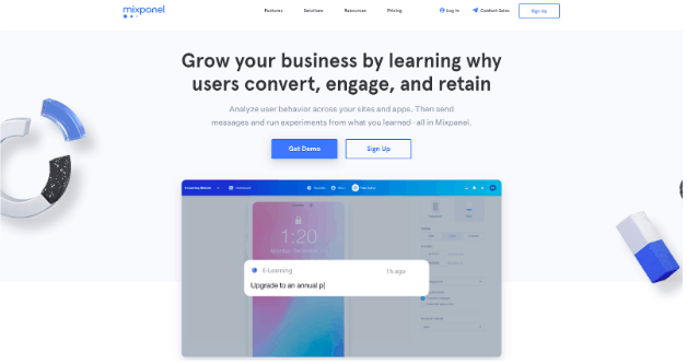
Unique Selling Proposition
A unique selling proposition answers any visitor’s primary question: “What in it for me?” To accomplish this, you need a benefit-oriented, clear, and concise headline and a subheadline that provides brief context or elaborates on the headline’s promise, giving the visitor a reason to stay and read more.
For example, Mixpanel tells any visitors that they can “Grow your business by learning why users convert, engage, and retain.” That’s valuable information for a small business owner, and a unique selling position that will keep them reading.
Compelling Body Copy
Body copy should be scannable and focus on benefits rather than features. Instead of listing what your product is, describe what your user will actually get from using the product. Use short, easily digestible paragraphs or, preferably, benefit-driven bullet points to highlight the key takeaways of the lead magnet.
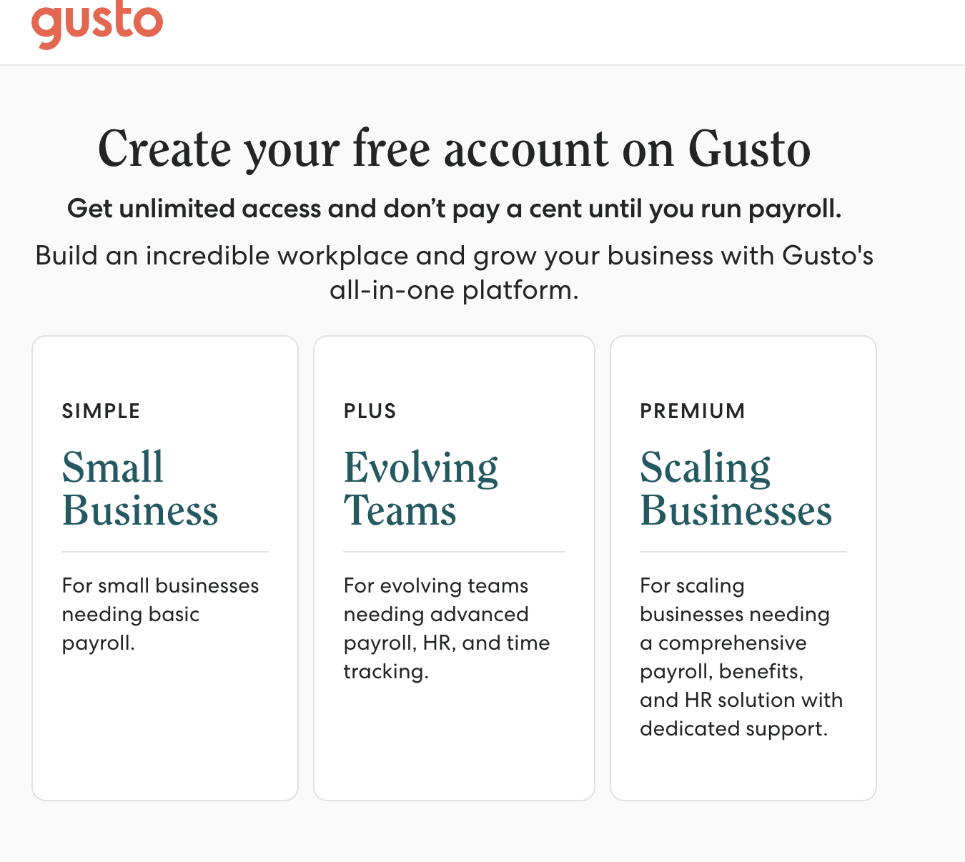
Gusto’s sponsored ad lead capture page is a highly efficient example:
The Lead Capture Form
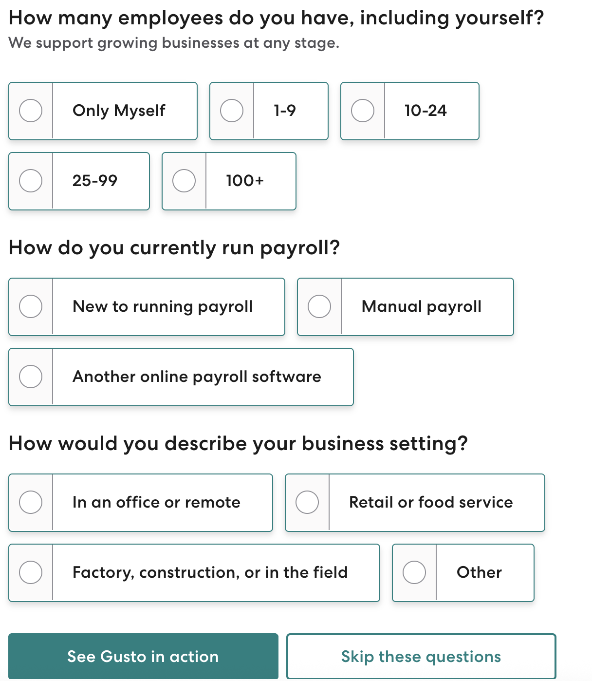
The lead capture form is the literal point of any lead capture page. Its design can make or break its success. The fewer fields you include, the lower the friction, resulting in a higher volume of leads. But the more fields you include, the better and more ready the leads will be to convert into customers.
Always start with the absolute minimum: name and email address. Add more fields if it’s essential to qualify the lead or more information justifies the extra friction. That same Gusto page has a fairly high-friction form, but it works because it allows the system to better understand the customer immediately and provide the right level of service.
The Call-to-Action (CTA) Button
The CTA is the final instruction you give your visitor, and it must stand out. In the example above, there are actually two: “See Gusto in action” and “Skip these questions.” The first moves the visitor through the funnel to set up a demo for the product. The second leads straight to an account setup page.
Gusto leverages a few best practices here. They use a contrasting color that immediately draws the eye, and they use action-oriented, specific phrases that make the offer clear.
Social Proof and Credibility
Any potential buyer is typically skeptical. They want to make sure they’re spending their money wisely. Social proof can help build trust and reduce anxiety.
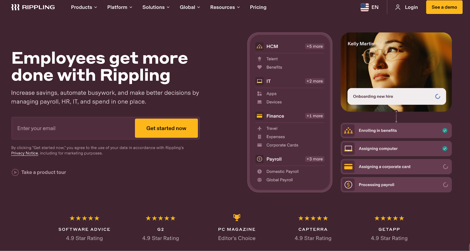
Some of the most common forms of social proof are testimonials. These short, authentic quotes from previous users or customers can address a pain point that the lead magnet solves. You can also include trust seals like client logos, industry awards, or simple numerical proof like “Trusted by 10,000 Marketers” to make your lead capture page stand out. Professional Employer Organization (PEO) Rippling does just that:
Design and Layout Best Practices
A great lead capture page isn’t just about copy. You also need to eliminate noise to facilitate conversion. That’s where design best practices come into play.
Visual focus and directional cues
Minimalism is key for any landing page. You should remove all website navigation, footers, and links that lead away from the form and ensure the unique selling point, key benefits, and CTA button are all visible immediately upon landing without the visitor having to scroll. (This is called “above the fold.”)
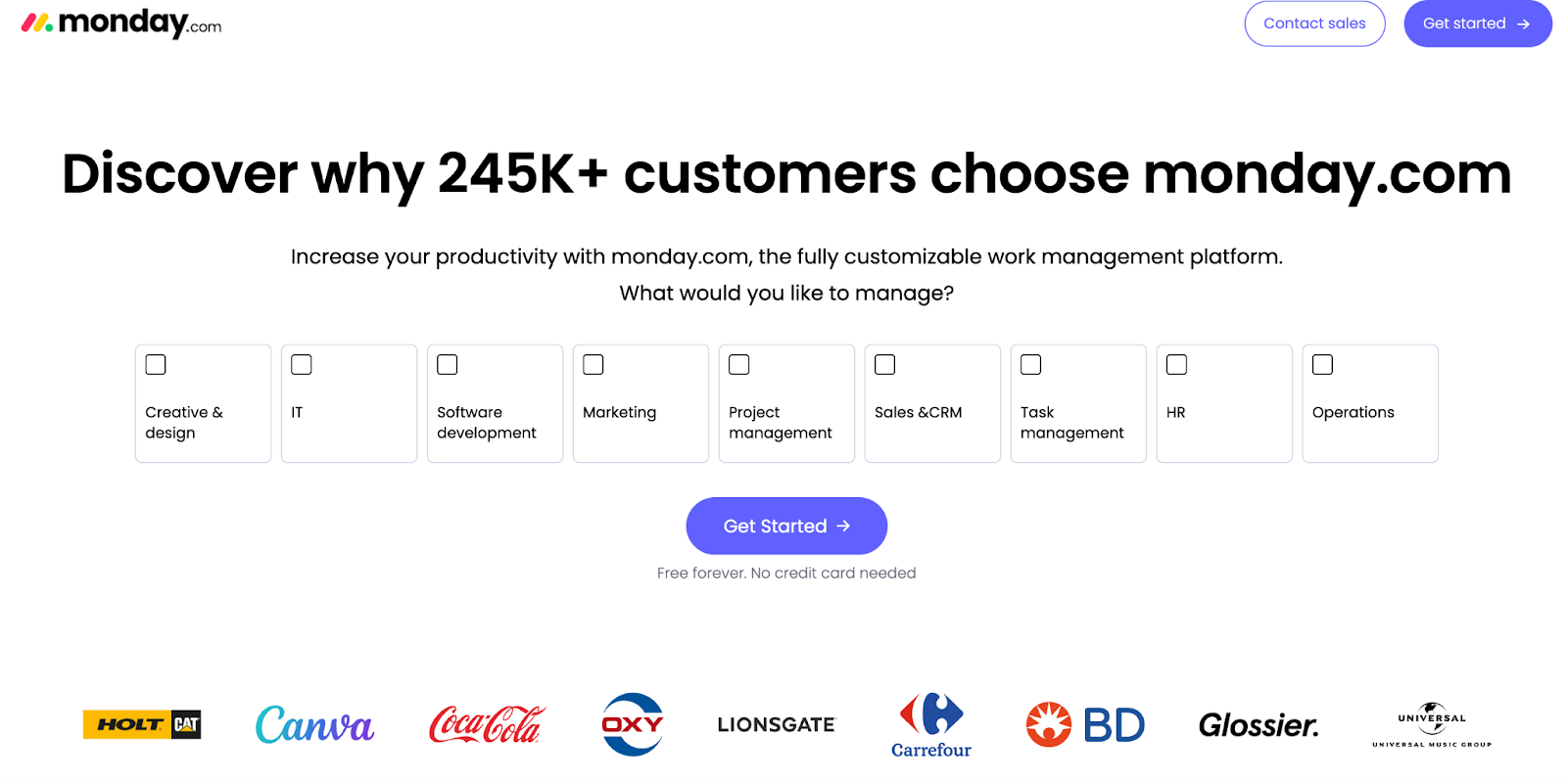
Use size, color, and directional cues like arrows or images of people looking at the form to guide the visitor’s eye straight to the CTA. Monday.com makes their CTA a distinct color, puts it right in the middle of the page, and uses an arrow to give you the feeling of moving forward in the funnel.
Media use
Using high-quality imagery, relevant product screenshots, or clear videos to represent the offer is all essential. And don’t forget that over half of web traffic is mobile, so your lead capture page must be fully responsive and look great on mobile.
Clarity and Consistency
One of the most common reasons LCPs fail is a lack of message match. The headline on your landing page must perfectly match the text used in the ad, banner, or email that brought the visitor there. If your Facebook ad promises “The 5 Best Productivity Hacks,” your LCP must not say “Download the E-Book.” The copy must align to reassure the visitor they are in the right place.
Post-Conversion Strategy and Metrics
When the user clicks your CTA, your job isn’t done. Really, it’s just beginning. When they click through, you need to provide immediate fulfillment of the lead magnet. Whether it’s a thank you page or confirmation page, you have to provide a download link, explain an email is on its way, or otherwise fulfill the offer right away. Then, you can use this page to introduce the next step in the funnel. That could be inviting them to follow your company on LinkedIn, booking a free consultation, browsing your latest blog posts, or something else.
Finally, no business initiative is complete without analysis. To optimize your lead capture page, determine the key performance indicators (KPIs) you want to track and monitor them closely. Some common options include:
- Conversion rate: The percentage of visitors who completed the goal.
- Cost per lead: How much you’re spending to acquire a single lead.
- Time on page: How long somebody spends on the page. A low time may indicate a confusing layout or poor message match.
The more data you gather, the more you can refine your lead capture page to best suit the needs of your potential customers.
FAQs
Conversion rates vary significantly by industry and the quality of the traffic source. A decent benchmark to aim for may be 5% to 10%, but highly focused pages with great message match and warm audiences (like email subscribers) could be double that or more.
Probably not. The main goal of a lead capture page is to be singularly focused. Including your main navigation gives the visitor an escape route and a reason to click away from the conversion goal, even if there will be several more opportunities on your homepage. Remove all navigation menus, footers, and links that do not lead to the form or a privacy policy.
Optimization should be an ongoing process. Start by testing the most impactful elements, like the headline and CTA copy, first. When you have an obvious winner, move on to smaller elements like image placement, social proof placement, or CTA color. Always test one element at a time.
Take a look at our news on Marketing & Sales