What Is a Hamburger Button?

September 11, 2025

 Table of content
 Share
Share
A hamburger button (☰) is a toggle menu icon with three horizontal lines stacked on top of each other that resembles the shape of a hamburger. When clicked or tapped, a hamburger button reveals or hides a menu called a navigation drawer that slides out. The clicked hamburger button may transform into an X to close it.
When placed at the top left corner of the screen, the hamburger menu may replace or be next to a navigation bar. Desktop and mobile users easily recognize this common design element, which saves space and looks clean. The hamburger button can be customized to modify the color, shape or size of the lines.
History of the Hamburger Button
Norm Cox, an American interaction designer, created the hamburger icon. He was the graphics lead for the Xerox Star, the first commercial personal computer introduced in 1981. Its function was to be a collapsible menu with a list of options. The simple and unique design resulted from the lack of available pixels at the time.
“I called it a hamburger icon because it looked like a hamburger. I never thought it would become a universal UI element,” said Norm Cox.
In 1985, Windows 1.0 contained a hamburger button, which quickly disappeared from future versions of Windows until it reappeared in Windows 10. The hamburger button disappeared everywhere for decades.
The popularity of the hamburger button emerged around 2008 with the growth of smartphones that needed compact designs to fit the small screens. Early trend-setting users were Facebook and Apple’s Twitter client, called Tweetie, created by Loren Brichter. Today, the hamburger button serves as a staple in mobile and web design.
Hamburger Button Examples
On desktop devices, the hamburger button usually appears in the top left corner of the screen. In mobile apps, it frequently appears at the bottom of the screen. See how the hamburger button looks in these desktop screenshots.
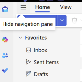
In Outlook on the Web, the hamburger button on the top left of the screen hides or shows the side navigation drawer displaying the folder names.
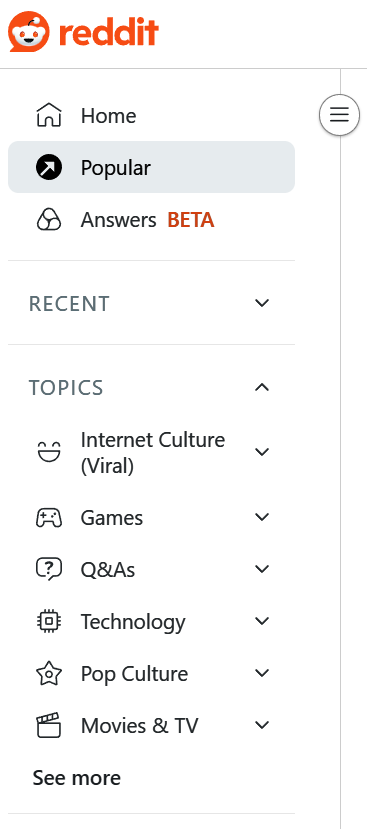
On Reddit on a desktop, clicking the hamburger button shows this side navigation drawer with many menu options.

When viewing the Harvard Business Review (HBR) website on a desktop, a customized hamburger button appears above the primary navigation bar.
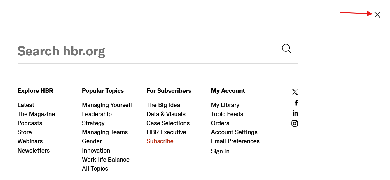
When the HBR hamburger button is clicked, it reveals this search box and multiple menus. On the top right, there is an X to close it.

On a desktop, the Amazon website has a hamburger button labeled with the word “All.” When clicked, it reveals a hidden side navigation drawer with a long menu and an X to close it. It is part of the primary navigation bar.
In mobile apps, the hamburger button is usually placed at the bottom. These Android screenshots show the hamburger button on the Alexa app, Amazon shopping, and CNN. On Alexa and CNN, notice how the three lines are not the same size.
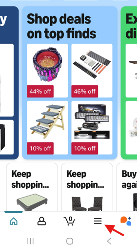
In the Amazon shopping mobile app, the hamburger button appears at the bottom of the screen.
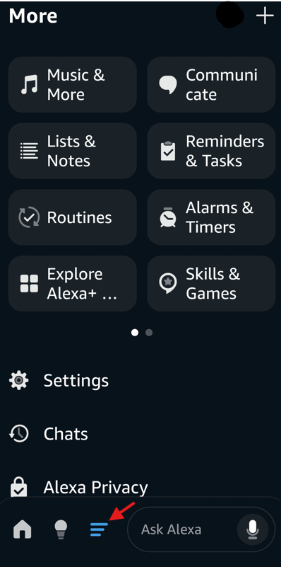
When the hamburger button is clicked at the bottom of the Alexa app, it turns blue and displays another screen with more options. The shape of the hamburger icon has been modified with each line smaller than the one above.
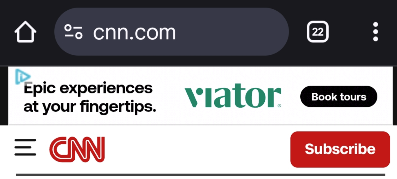
On the CNN mobile website, the hamburger button is on the top left next to the CNN logo. The middle line of the icon has been modified to be shorter than the other two lines.
Benefits of the Hamburger Button
Many designers love the hamburger button and its multiple benefits. With a clean design ideal for small screens, it has distinct advantages for mobile designs and responsive websites.
- Clean design: The hamburger button provides a sleek, minimalist design that fits all screen sizes. Cluttered navigation bars can overwhelm users, and they require larger screens.
- Saves space: When designing websites and apps, designers need to balance conserving space with fitting everything that the client wants. With the limited space on device screens, a hamburger menu easily solves the space problem.
- Responsive designs: It works well for responsive designs where the same website or app needs to adapt to multiple desktop and mobile devices.
- Enhances mobile designs: Apps and responsive websites demand compact designs that would be impossible to achieve without using navigation drawers. The hamburger button easily accommodates many menu links.
- Secondary navigation access: While primary navigation elements can fit in a simple navigation bar, secondary navigation elements will not, especially on content-heavy sites. The hamburger menu is the ideal place to put secondary navigation elements.
- Streamlines navigation: The hamburger button simplifies navigation, making it more efficient. Users find it helpful when they can access many links from one place.
- Universal symbol and function: Users widely recognize the three horizontal lines that are called a hamburger button. When looking for navigational elements, most users know to click or tap it. Research from the Nielsen Norman Group found that the hamburger button is now a familiar pattern. They discovered that “even small design variations with the hamburger icon didn’t cause major issues, provided the typical position was maintained.” The typical position means the top left corner of the screen.
Drawbacks of the Hamburger Button
The hamburger button is controversial with several drawbacks. Designers engage in frequent debates and critiques of the hamburger button.
- Usability: While many users will easily recognize it, others may need text or a label to point it out. Some target audiences, like older adults, may have a harder time recognizing it and be unaware of the hidden menu options it provides.
- Confusion: In addition to a potential lack of recognition, users may be overwhelmed and confused by too many menu options when the button is clicked. The lack of visibility for hidden menu items results in some users missing key features, especially new visitors.
- Lacks Intuitiveness: The unintuitive hidden icon can cause frustration and navigation delays as users struggle with where to find things.
- Accessibility issues: Depending on how the design is implemented, screen readers may not recognize it.
- Lower engagement rates: The hidden menus have lower engagement rates since they are harder to discover, require more clicks and slow down users.
Hamburger Button Best Practices
The hamburger button is best to use on small screens and responsive website designs. It is recommended to place it on the top left corner of the screen and to use the widely recognized design of three stacked lines without any modifications, extra styling or borders. Use subtle animation and transitions, such as a X to close it.
Making modifications to the design or incorporating other three-line design icons that have different functions can confuse users. Designers recommend making it big, using contrast to make it obvious, and adding text labels next to it for audiences that may not be familiar with the hamburger button.
The Interaction Design Foundation recommends using the hamburger menu in the following situations: secondary navigation, mobile apps, minimalist designs and content-heavy platforms. They suggest avoiding it in these cases: primary navigation, high-engagement areas, when the target audience may be unfamiliar with the icon, immediate calls to action, and when fewer navigation points are available.
Ways to Install a Hamburger Button
“In web development, the hamburger menu is typically achieved using hypertext markup language (HTML), cascading style sheet (CSS), and JavaScript. The three lines are created using HTML elements, usually ‘or’, and styled with CSS to achieve the desired appearance. JavaScript is used to handle the menu’s opening and closing functionality when the icon is clicked or tapped.” – Lenovo
Many website platforms, including Content Hub and Squarespace, have built-in options for adding hamburger buttons without the need for CSS or HTML coding. Step-by-step instructions show how to add hamburger menus on specific sites, such as Wix and Webflow. In WordPress, a hamburger button is made from a combination of plugins and theme customization.
Alternatives to the Hamburger Button
There are many alternatives to hamburger buttons. From mega menus to meatball menus, here are some popular options.
- Tab bar: When all primary options are persistently displayed across the bottom or top of the screen to switch between major sections, it is called a tab bar.
- Top or bottom navigation bar: To facilitate navigation within a hierarchy or specific section, top or bottom navigation bars are used.
- Mega menu: All the navigation options are displayed at once in a mega menu unlike the hidden options in a hamburger button.
- Floating menu: This type of menu appears when you hover your mouse over a certain area without having to leave that screen.
- Accordion menu: Vertical stacked lists that expand or collapse are called accordion menus.
- Progressively collapsing menu: As the screen space gets smaller, the menu progressively collapses. The word “more” is used for the hidden elements.
- Ellipsis menu: Three dots stacked vertically is called a kebab menu, while three dots stacked horizontally is called a meatballs menu. It is typically used for context-specific actions or settings, unlike the hamburger menu that is used for navigation.
A hamburger button is a widely recognized icon that suits compact designs. By following best practices, designers can minimize many of the potential drawbacks.
Latest resources
Take a look at our news on Business Technology